Abstract
- Jun 7, 2022
- 2 min read

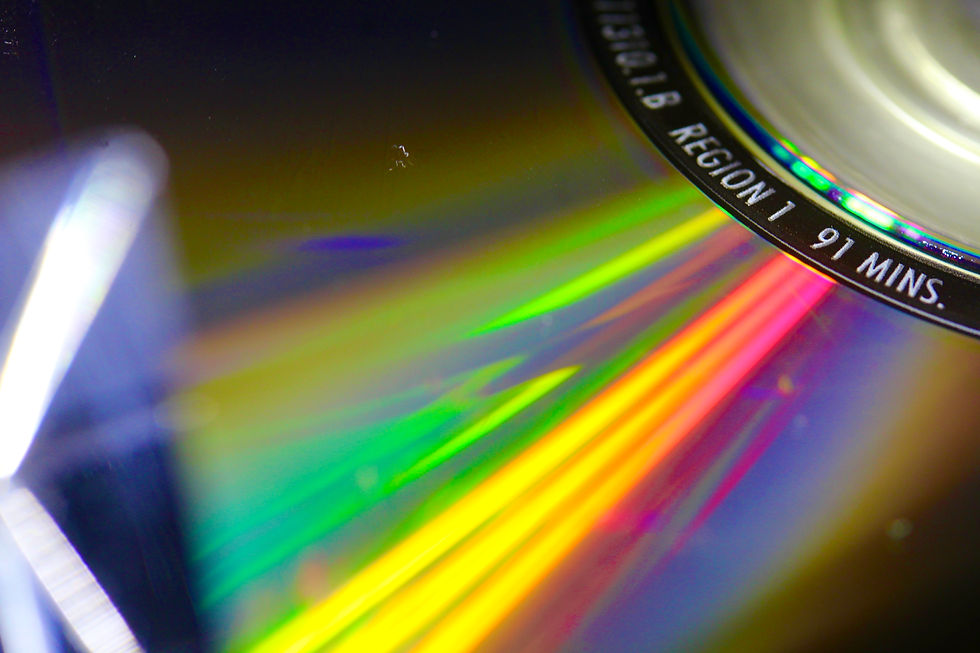
This photo uses colour and lines with the colour lines leading to the middle of the cd. I used a prism and flashlight to reflect a stronger colourful light off of the cd to create a more attention grabbing photo.

This photo uses colour, pattern, emphasis and movement. There are different patterns created by each light painted colour, emphasis from the bright colours standing out against the black back round and movement is used for the light paintings being moved with a slow shutter speed.

This photo uses colour, shape and space. The bright green makes the main part of the photo stand out, there are different shapes created by the lock and chain, then positive space used by the main subject of the photo.

This photo uses pattern, space and shape. The pattern is created from the repeated spiraling pattern of the light bulb, the object takes up the positive space in the photo and this photo uses the objects unique shape to add a more abstract element to the photo.

This photo uses value, space and repetition. The value is used from the black back round all the way to the bright white lights throughout the photo, the negative space helps grab more attention to the photo and repetition is used from every little flash of light that is spreaded throughout the photo. This photo looks like spark flying every where but it is a unique light that is used to have a abstract photo.

This abstract photo taken by Ola Kolehmainen was my inspiration because it is such a unique photo using so much repetition and shapes to give that abstract feature to it. She took a bridge and the reflection of the water with some editing to create this eye catching photo.


Comments